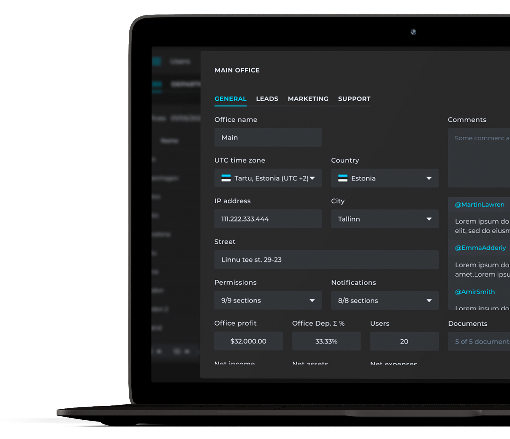
Customer Relationship
Management System
for Pentview
Project background
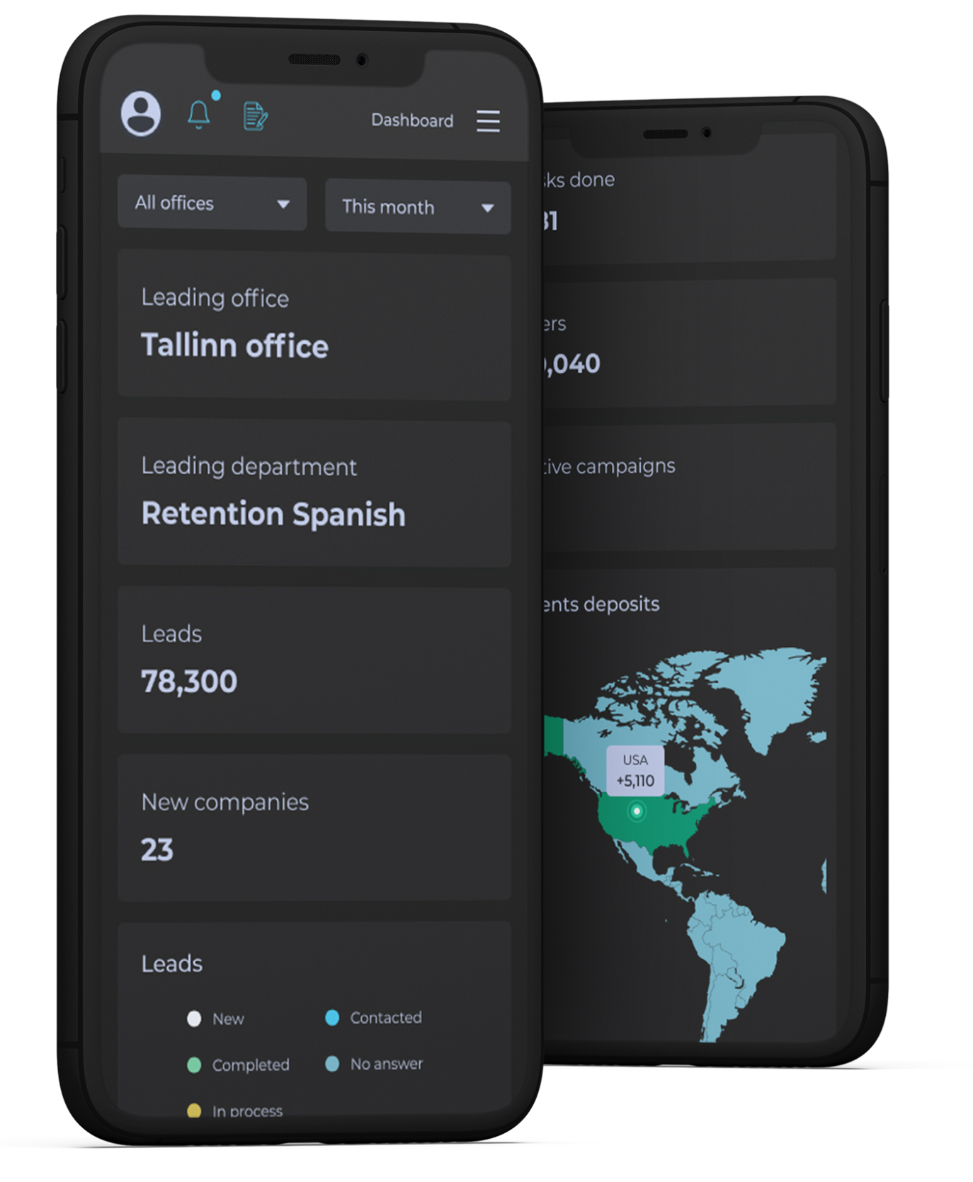
Pentview already had WebTrader, their trading platform. But client data lived completely separate from it — different system, different logic, no real connection between the two. We designed the CRM to sit right alongside WebTrader as part of the same ecosystem, built in parallel rather than added on after the fact.
Challenges
- Design the CRM and WebTrader to work as one system from day one — not bolt them together after the fact.
- Keep up with how fast CRM tech moves, so it doesn't feel outdated in a year.
- Scale with the business. More leads, more teams, same speed.
Research
22 surveys
Who we talked to
CRM users at Pentview — age 21 to 45, 1 to 7 years of experience. Most have a background in Business, Finance, or Marketing, through a full or partial degree.
Key Findings
90% open the CRM daily.
Main pain points:
- Hard to find client info quickly
- Confusing navigation
- Leads fall through the cracks
- No clear way to prioritize tasks
What they're asking for: call integration with auto-logging — and a real task system, since most still track work in spreadsheets and sticky notes.
Some of the questions
- Walk me through what happens when a new lead comes in — what's the first thing you do?
- Tell me about a time something slipped through the cracks. What happened, and why?
- When a client calls and you need their history right away, where do you actually look first?
- What's the most annoying part of switching between WebTrader and the CRM during your day?
- If you could change one thing about how you track follow-ups, what would it be — and why does it bug you?
User personas

Michael, 32 (Sales manager)
Goal
Increase Sales Efficiency
Pain Points
- Easily distracted
- Complicated comment system
- Navigation difficulties
- Too many bright colors

David, 35 (Sales Lead)
Goal
Improve Team Performance
Pain Points
- Hard to track leads and sales data
- Unintuitive interface
- Not enough client info
User flow
Michael, Sales Manager
01
Log into CRM system
- Enter login credentials.
- Verify identity through 2FA.
- Access the CRM dashboard.
02
Navigate to Clients tab
- Open the main menu.
- Find the "Clients" tab.
- Click on "Clients" to open the table.
- Search for a specific client by name.
03
Change client status
- Find the current status in the client's details.
- Click on the status button.
- Select the appropriate new status from the dropdown menu.
04
Schedule a follow-up meeting
- Locate the Meeting management section in the client profile.
- Click "Add New Meeting."
- Set a follow-up call reminder for a specific date and time.
- Save the new meeting.
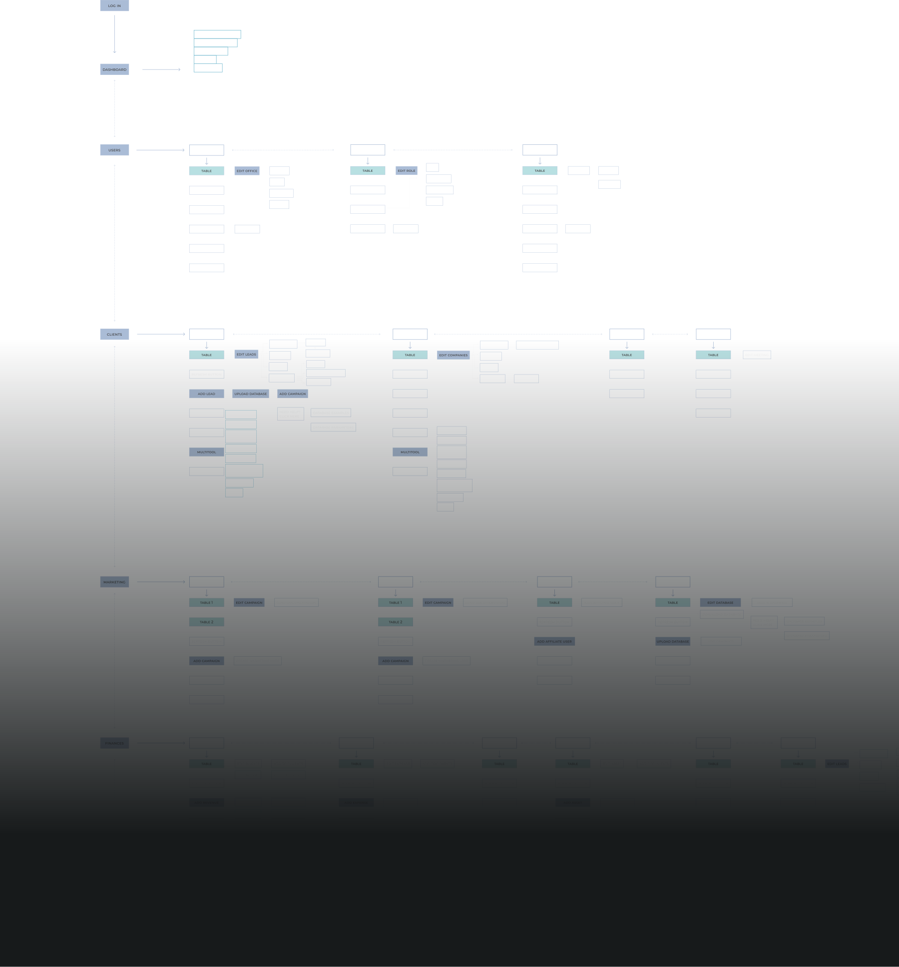
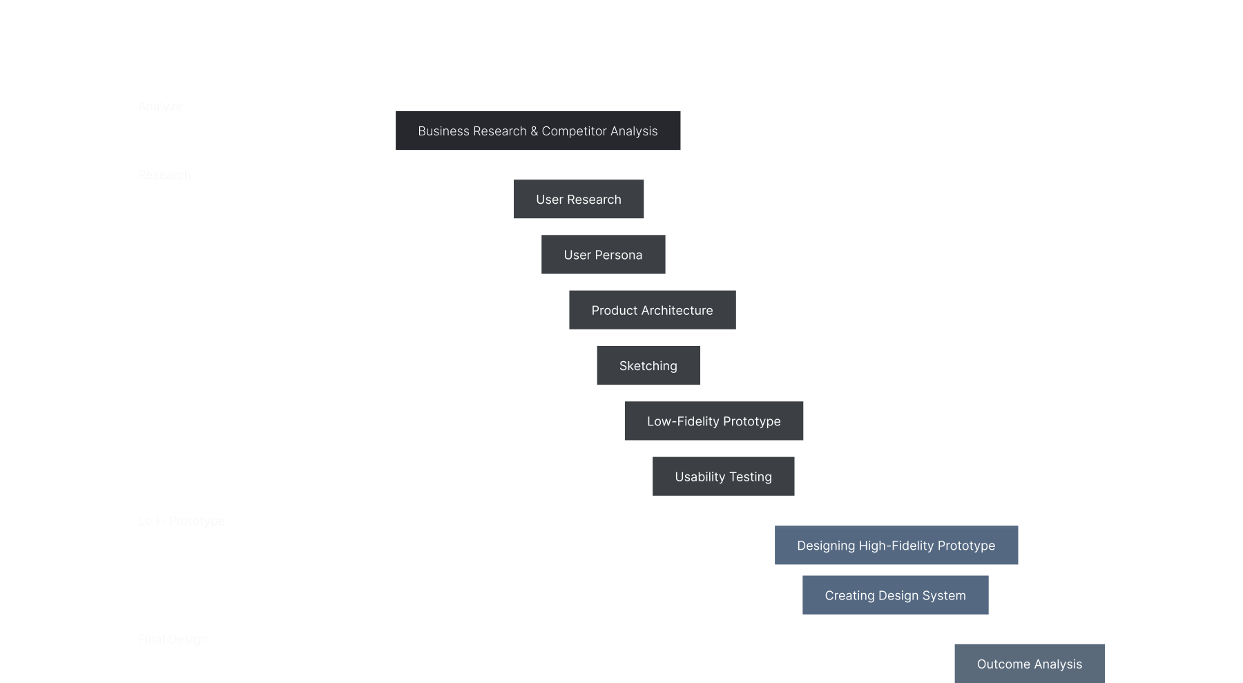
Product architecture
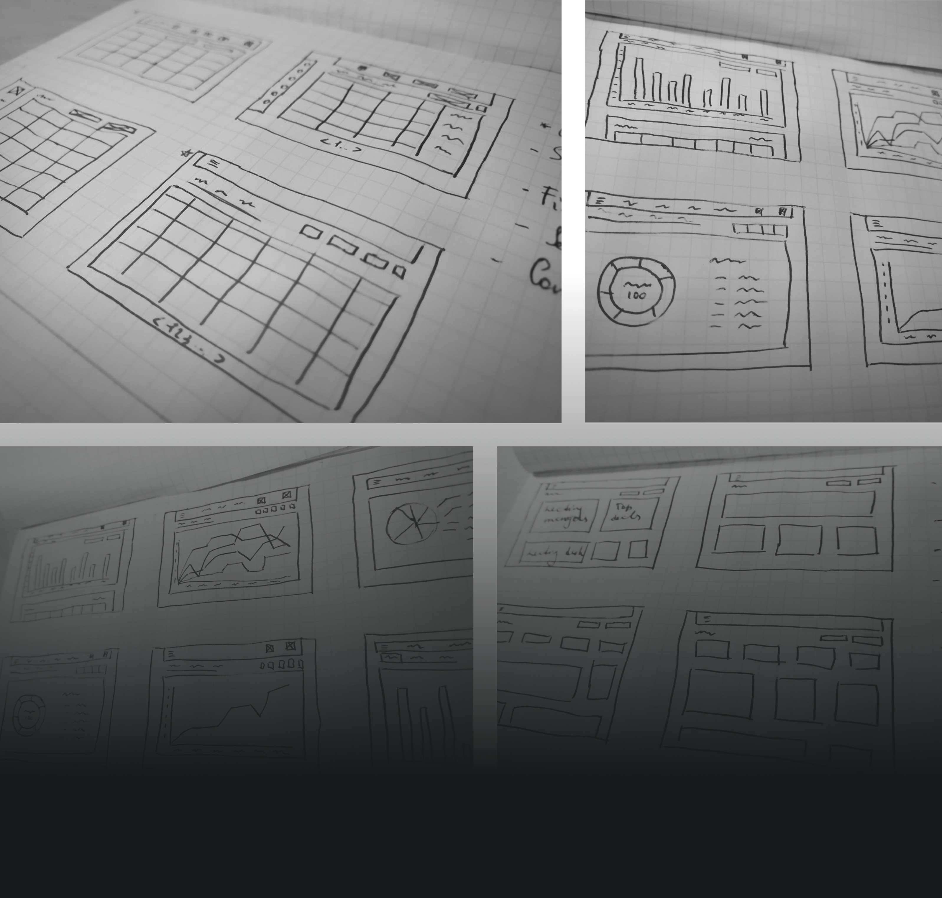
Sketches
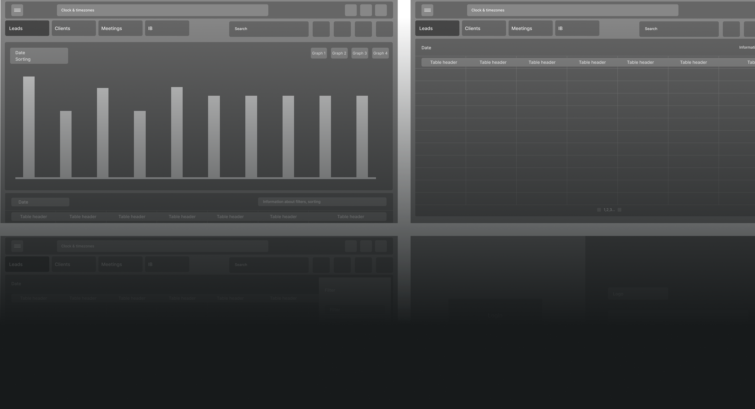
Low-fidelity prototype
Usability study
Moderated usability study
- Location: Ukraine, Kyiv.
- Participants: 12 individuals, majority sales managers.
- Duration: Each interview lasted approximately 30 minutes.
Objectives:
- Understand user pain points with the current CRM.
- See how users complete core tasks, and collect feedback to guide design decisions.
Key findings and how they changed the design
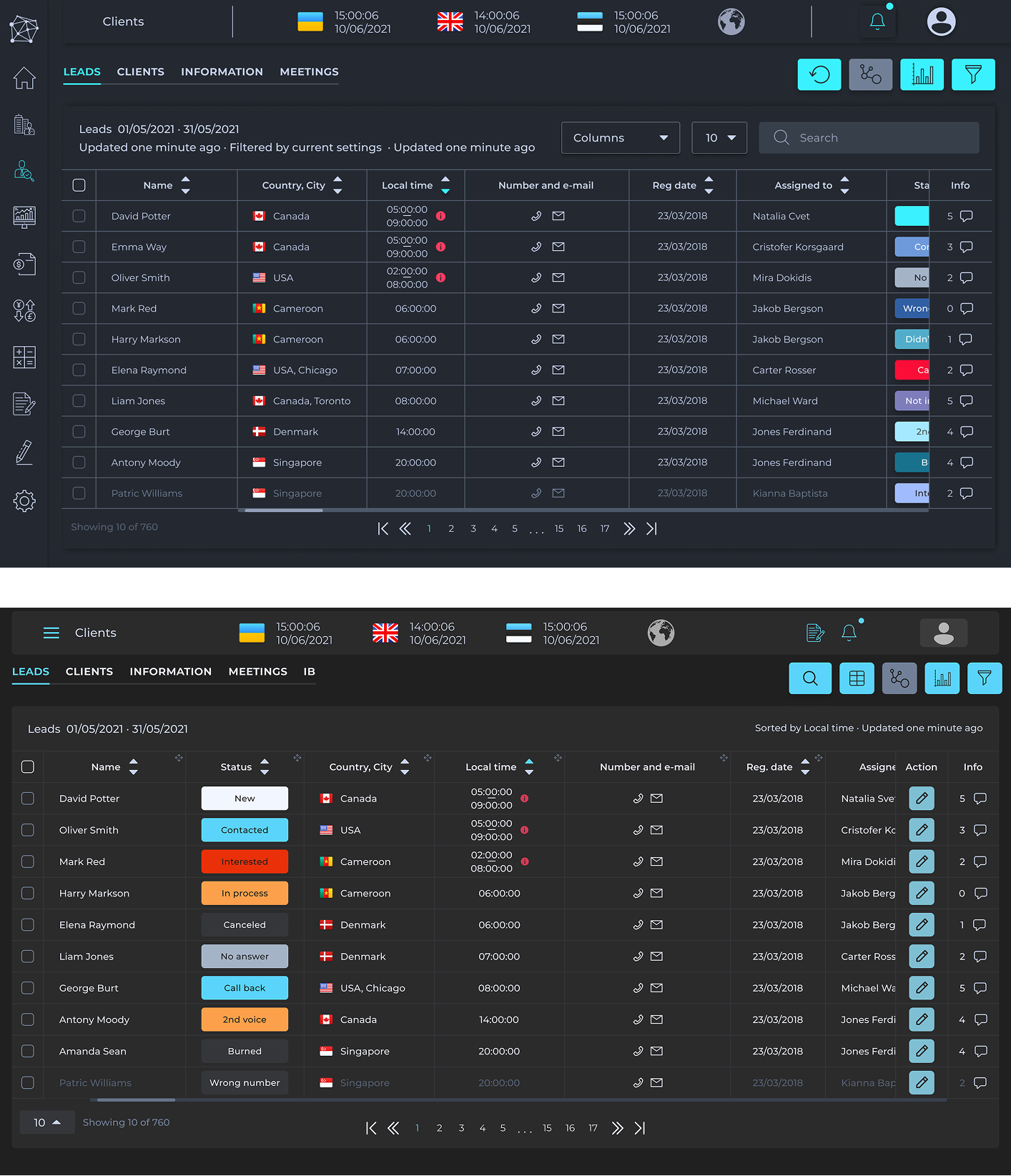
Color scheme
Problems
- The old status colors didn't meet accessibility standards — some users couldn't read them at a glance.
- Colors looked too similar, so people picked the wrong status by mistake.
Solution
New color scheme based on survey feedback — statuses are now easy to tell apart at a glance.
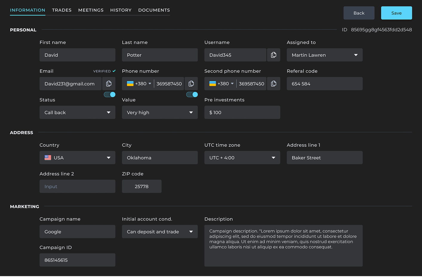
Limitation in viewing multiple clients
Problems
- Only one client profile could open at a time, in a pop-up — comparing clients meant constantly closing and reopening windows.
Solution
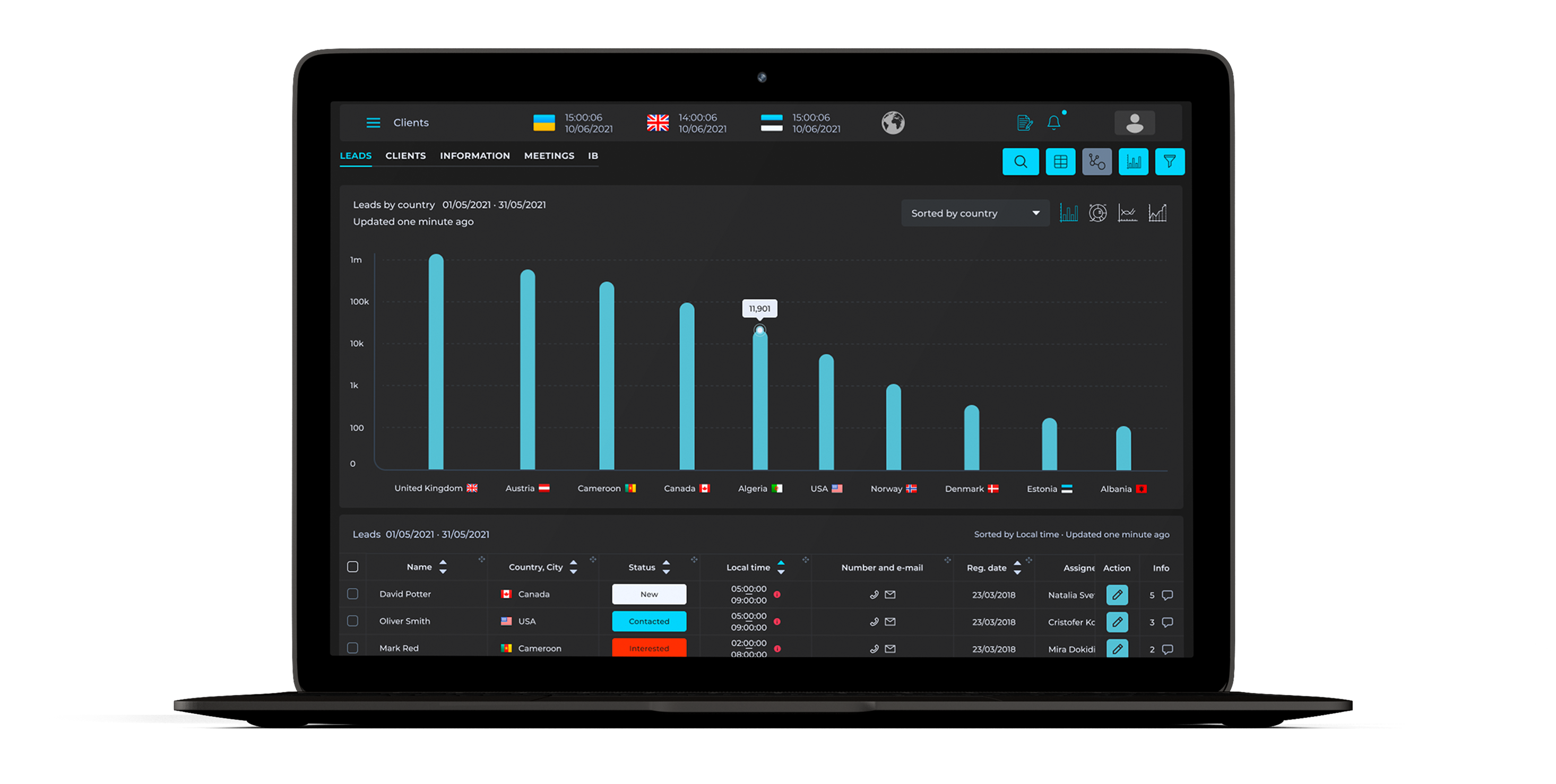
Client profiles now open as separate tabs, so users can switch between them and compare data side by side.
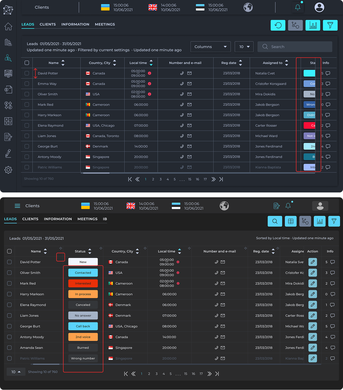
Lack of focus
Problems
- Users struggled to focus — the table felt cramped, and key info was hard to find quickly.
Solution
- Bigger cells. More breathing room, easier to scan.
- Customizable columns. Users can rearrange the table to fit how they work.
- Status moved to the front. It's the first thing people check — now it's the first thing they see.
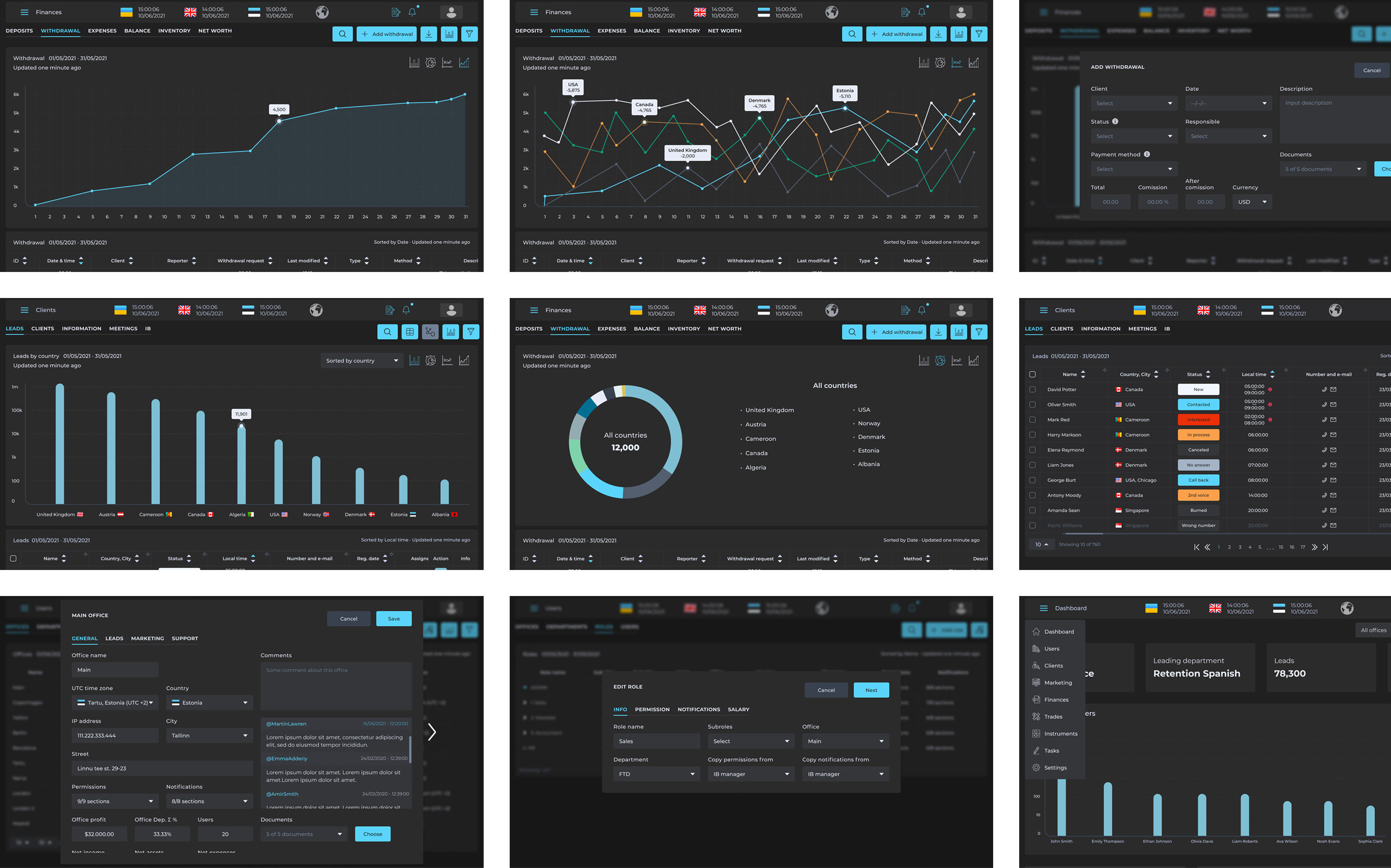
High-fidelity prototype
Typography & colors
Ab
Montserrat
Regular
Medium
Bold
Takeaways
Impact
The CRM has been sold to multiple companies and keeps attracting new clients. For a system built from scratch, that kind of traction is the clearest sign it actually works.
Solution
Ten months on a product this size taught me that a design system isn't a nice-to-have — it's what keeps the team from redesigning the same button for the fifth time. Building one from scratch here made every decision faster and every handoff cleaner.