All work

Web · Client project · 2023

Korpus-VK

Took a print-only custom-furniture business online for the first time.

Role
Sole designer — research, UX, UI, UX writing
Client
A regional custom-furniture studio in Ukraine
Scope
Landing page, brand voice, lead form
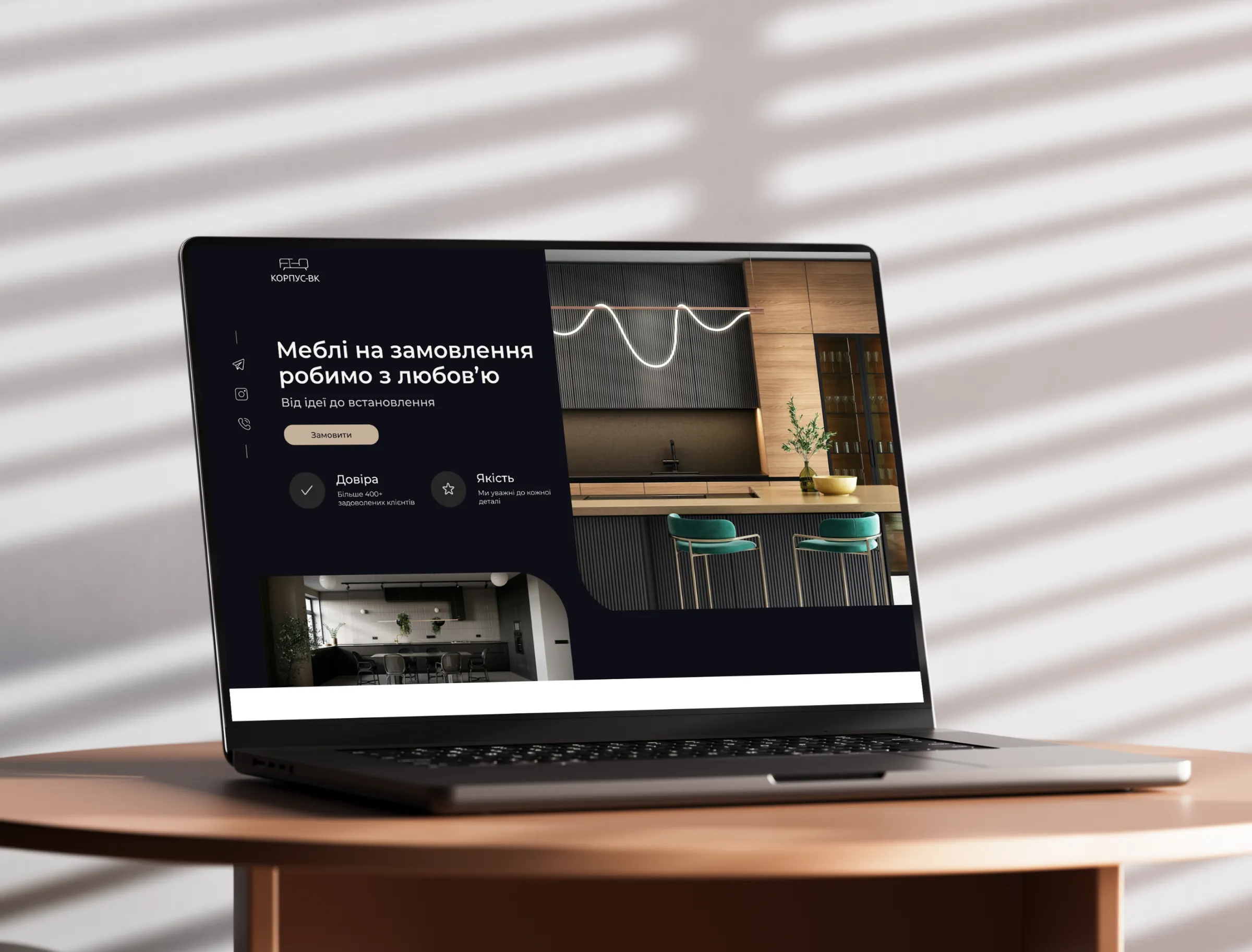
Laptop on a wooden table showing the Korpus-VK landing page: a dark first screen with the headline Custom furniture made with love, an order button, trust and quality highlights, and a kitchen photo

Context

Korpus-VK is a custom-furniture studio in the Poltava region of Ukraine, known locally for high-quality, handmade pieces. In 2023 it still relied only on print advertising, while competitors with a strong online presence were winning new clients. The studio needed its first website and a clear tone of voice.

Research

Market and competitor analysis, then a survey and interviews with 9 people from the target audience — homeowners and small business owners in the region.

Key findings

  • Competitors with a strong online presence and active social media get more engagement and conversions. Price, delivery time and clarity drive decisions.
  • Audience — homeowners and small business owners in the region and neighboring areas.
  • Interests — quality craftsmanship, unique and customizable designs, eco-friendly materials, space-saving solutions.
  • Pain points — limited custom options, high prices from competitors, long delivery times.
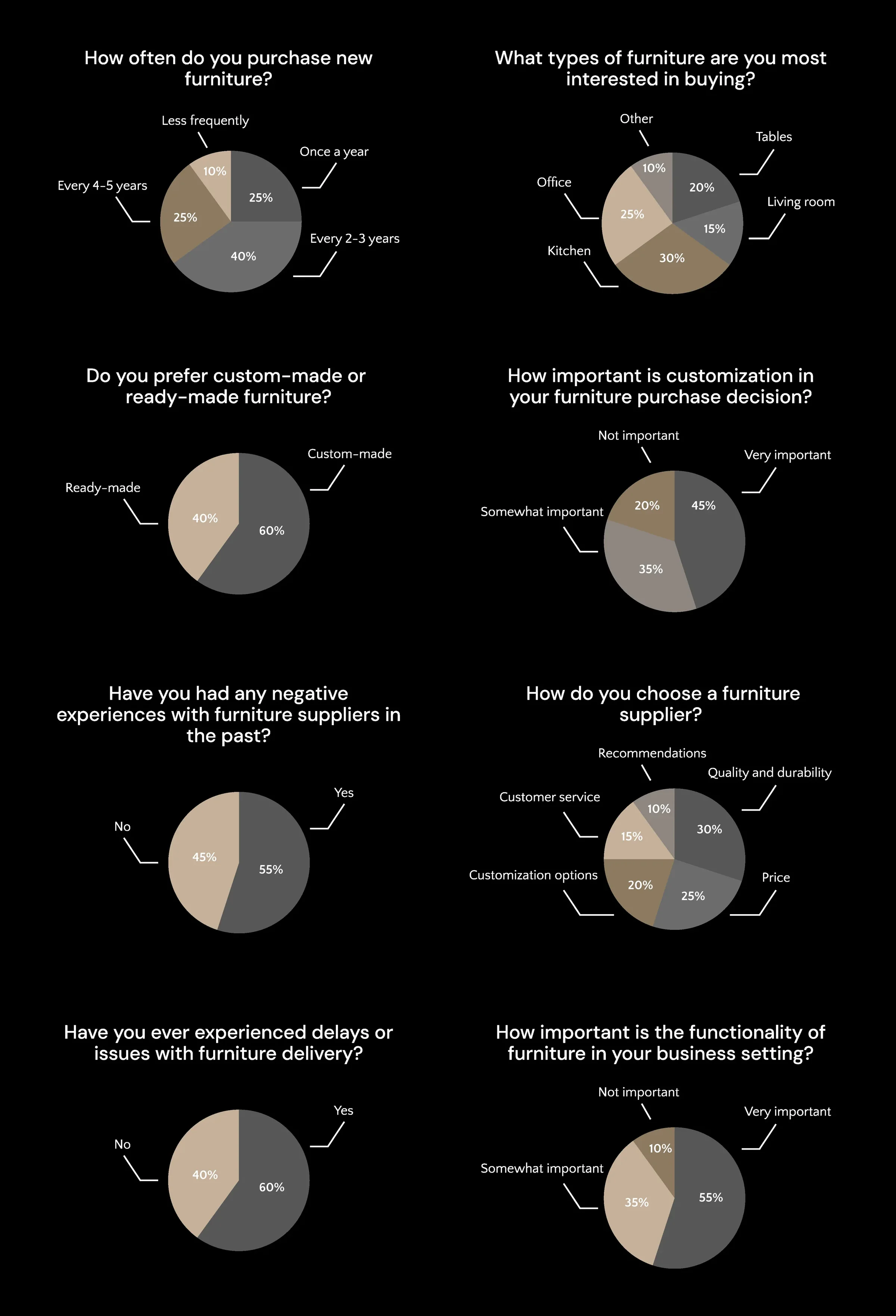
Eight pie charts of survey results: how often people buy furniture, which types they want (kitchens lead at 30%), custom-made versus ready-made (60% prefer custom), how important customization is, past negative experiences with suppliers (55% yes), how they choose a supplier (quality first, then price), delivery problems (60% had them) and how important functionality is for businesses (open full size)
Survey results.

User personas

Portrait photo used for the Olena persona

Olena, 38

Marketing manager, works from home

Goals
  • Stylish, high-quality furniture that fits her home and taste
  • Order without spending days visiting stores
Barriers
  • High cost of premium custom furniture
  • Hard to find options that meet her specific needs
Portrait photo used for the Dmytro persona

Dmytro, 45

Owner of a small chain of cafés

Goals
  • Durable, attractive furniture that reflects his cafés' identity
  • A reliable supplier with consistent quality and timely delivery
Barriers
  • High competition that demands standout interiors
  • Past delays and inconsistent quality from unreliable suppliers

Structure

Task flow

  1. Arrives on the landing page
  2. Sees the hero banner, tagline and a clear call to action
  3. Explores the features and benefits
  4. Views the showcase of custom furniture
  5. Fills out the contact form
  6. Finds answers in the FAQ

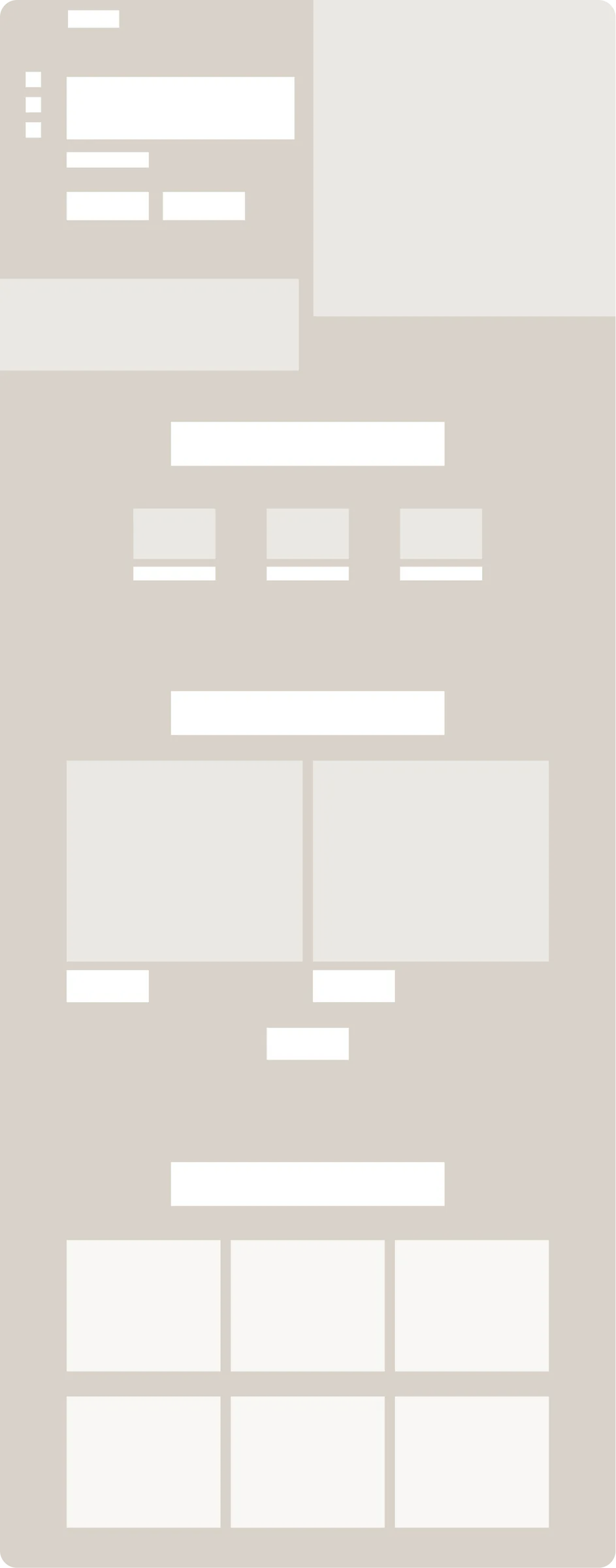
Wireframes

Tone of voice

Warm, confident and down-to-earth: a local workshop that cares about craft, not a faceless factory. Short sentences, concrete promises, no jargon.

  • «Меблі на замовлення робимо з любовʼю»

    “Custom furniture, made with love.”

    Leads with care, not with price.

  • «Від ідеї до встановлення»

    “From idea to installation.”

    Removes the fear of having to organize everything yourself.

  • «Всі меблі ми створюємо вручну в нашій майстерні»

    “We make every piece by hand in our own workshop.”

    Proof of quality instead of empty claims.

Key decisions

Trust first

Problem
Quality was the main concern users raised in research.
Solution
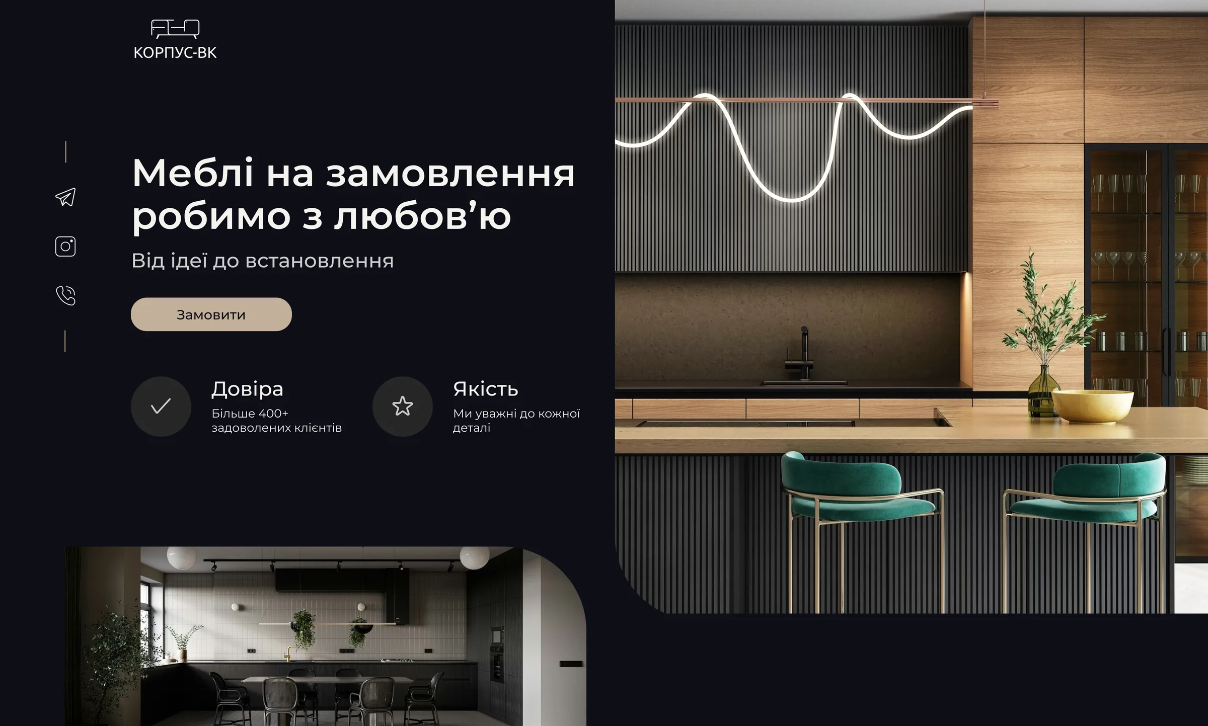
The first screen shows the number of satisfied customers and a quality guarantee, right under the headline and call to action.
Desktop first screen of the Korpus-VK landing page: headline Custom furniture made with love, an Order button, Trust (over 400 satisfied clients) and Quality highlights, next to a kitchen photo (open full size)
Trust and quality on the first screen.

Kitchens first

Problem
Kitchens were the most popular request — in the research and in the studio's own experience.
Solution
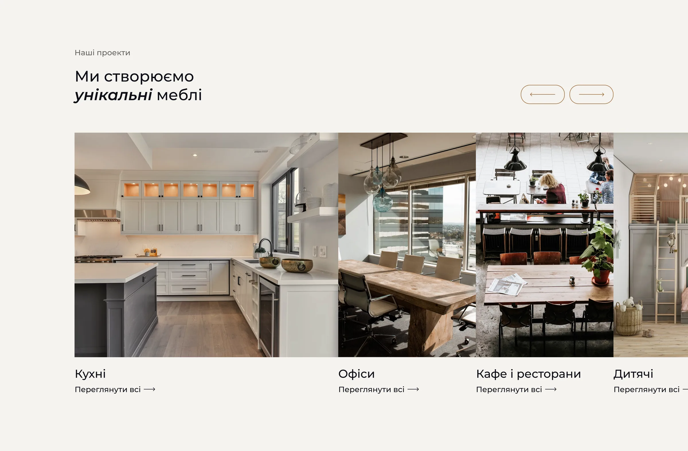
The portfolio opens with kitchens, so most visitors see the work they came for first.
Portfolio section We create unique furniture: a row of project photos that starts with Kitchens, followed by Offices, Cafes and restaurants, and Kids' rooms, with arrow buttons to browse (open full size)
Portfolio: kitchens come first.

The 6-step process

Problem
The audience had concerns about guarantees, materials, consultation fees and delivery.
Solution
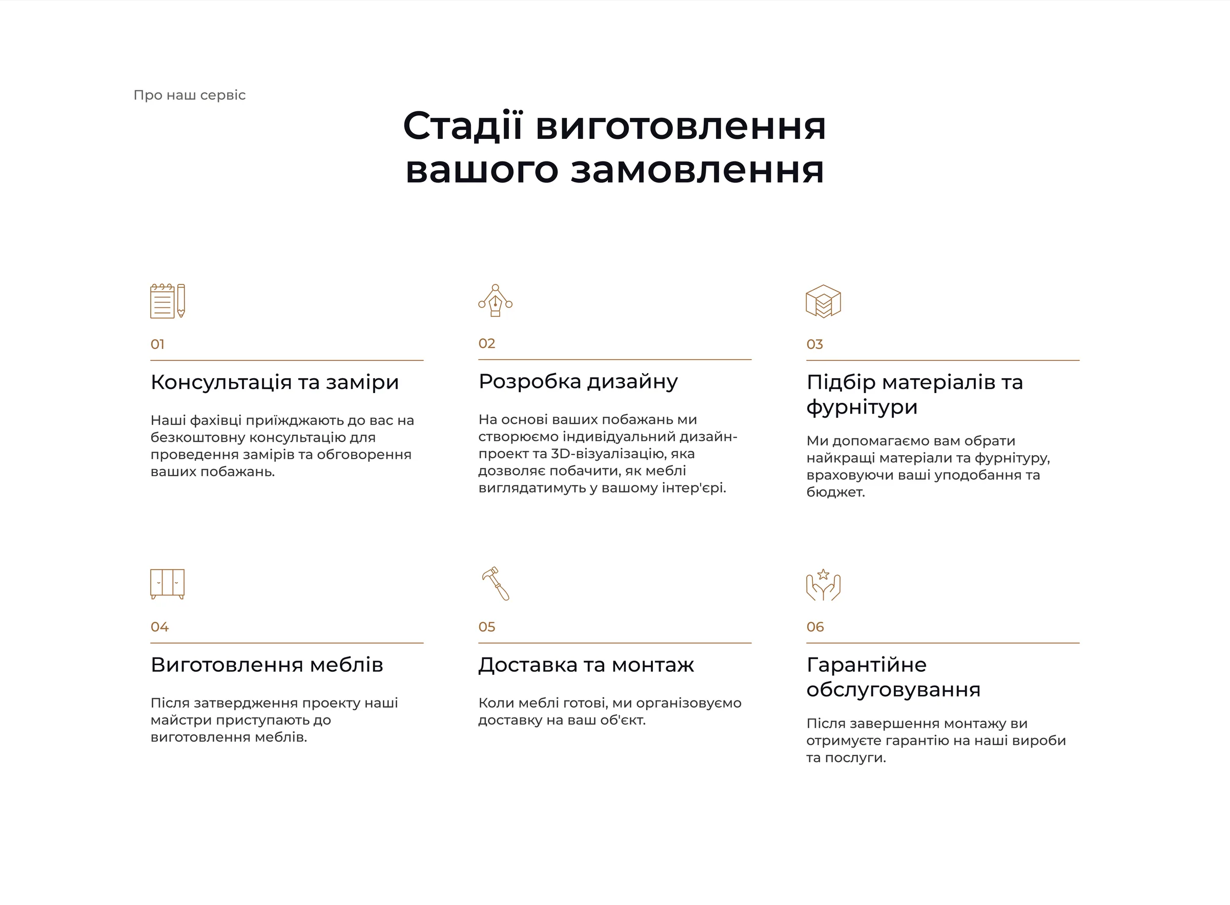
A section walks through the six stages of a custom order: free consultation and measurements, design, choosing materials and fittings, production, delivery and installation, and warranty service.
Section Stages of your order: six numbered steps with icons — consultation and measurements, design, choosing materials and fittings, production, delivery and installation, and warranty service (open full size)
All six stages of a custom order.

A deliberately short lead form

Problem
The studio is small — the owner personally takes every order and handles clients.
Solution
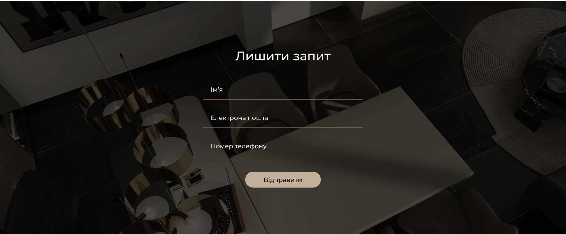
A simple form with just name, email and phone number — the best option for both him and the clients.

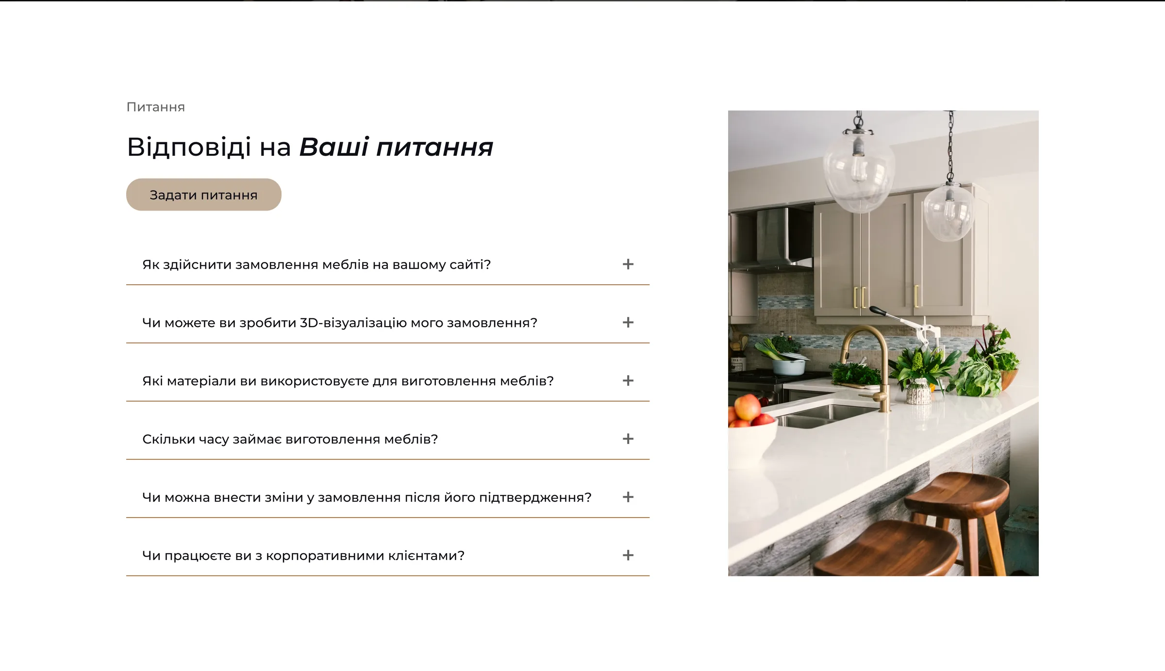
Below the form, an FAQ answers questions about delivery, changes to an order, prices and 3D visualization.

Leave a request form on a dark background with only three fields — name, email and phone number — and a Send button (open full size)
Three fields: name, email and phone.
FAQ section Answers to your questions: an Ask a question button and expandable questions about ordering on the site, 3D visualization, materials, production time, changes to an order and corporate clients, next to an interior photo (open full size)
The FAQ below the form.

The landing page

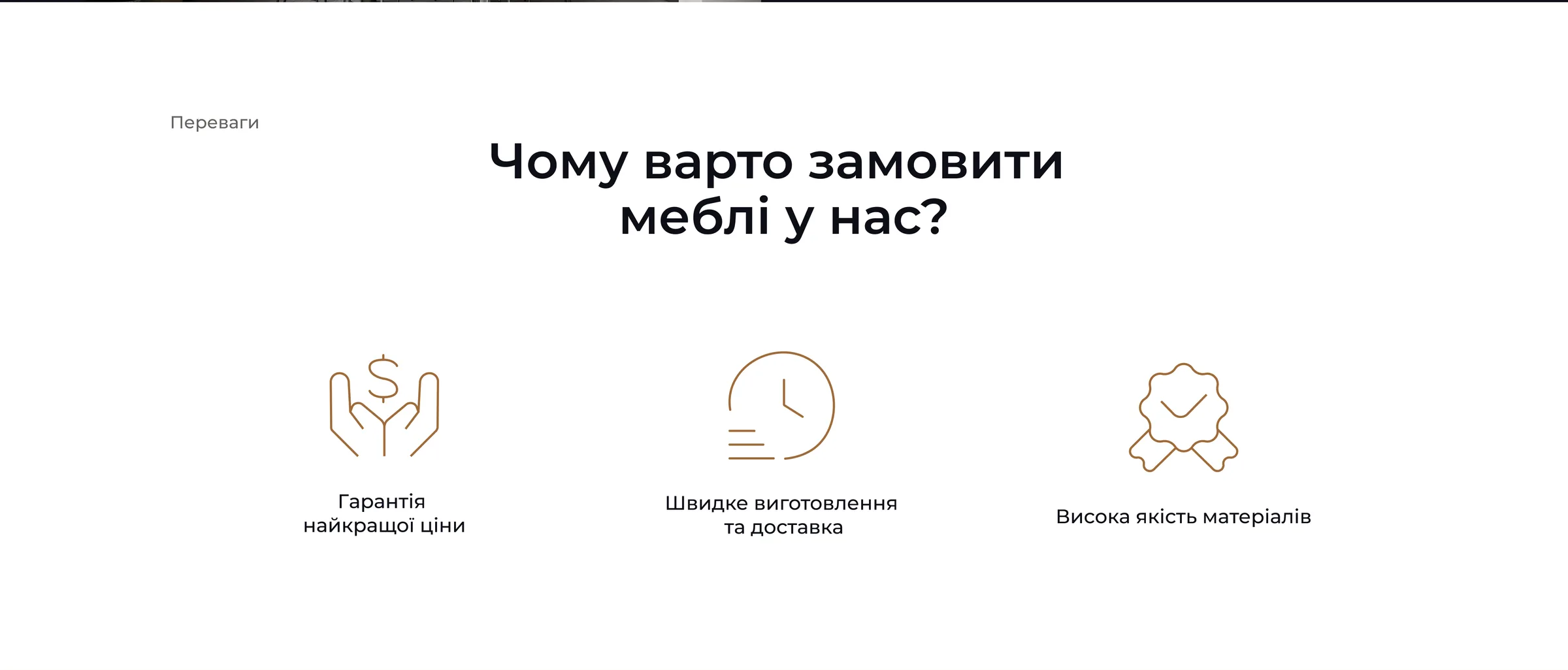
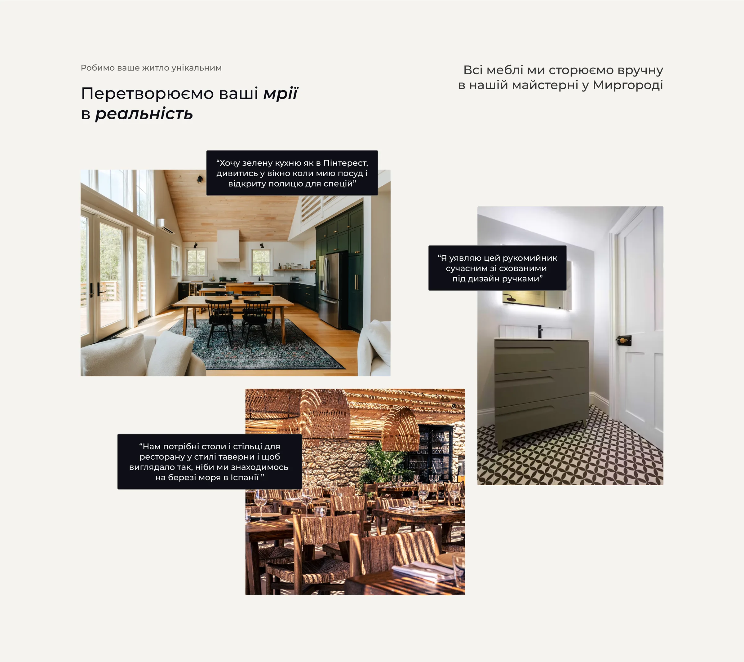
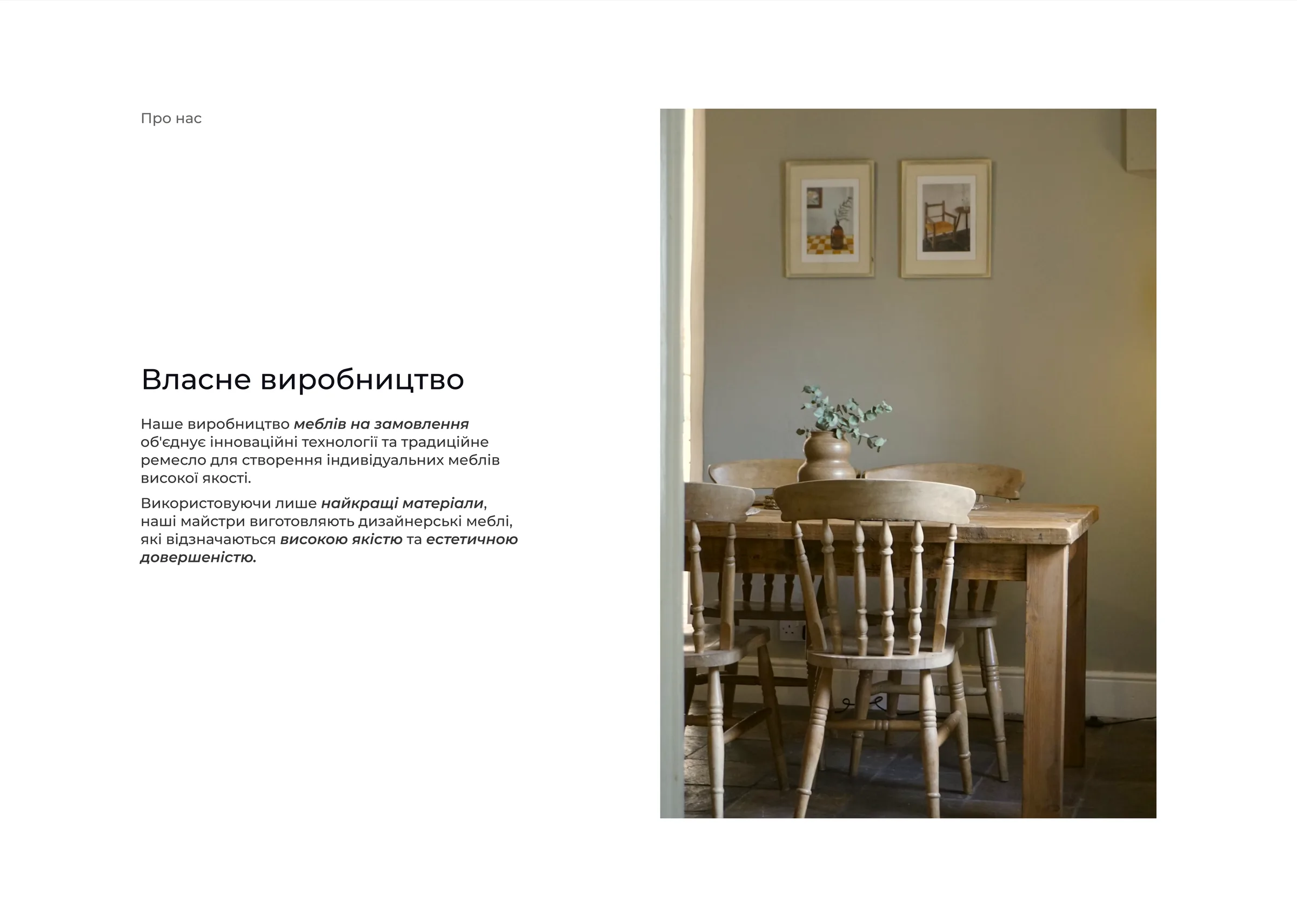
First screen: headline Custom furniture made with love, an Order button, trust and quality highlights and a kitchen photo Why order from us: best prices guaranteed, fast production and delivery, and high-quality materials We create unique furniture: project photos by category — kitchens, offices, cafes and restaurants, kids' rooms Stages of your order: six numbered steps from consultation to warranty service Turning your dreams into reality: interior photos of finished projects next to quotes from the client requests that inspired them Own production: a short text about the studio's workshop next to a photo of a finished dining room Leave a request: a dark section with name, email and phone fields and a Send button Answers to your questions: an FAQ list with expandable questions next to an interior photo Footer with the Korpus-VK logo, social links, address, email, phone and legal links
The full landing page, desktop.

Colors & responsive

Colors

  • #F5F3EF

  • #636260

  • #C4B09A

  • #9F6B39

  • #0E0E16

  • #CECECE

Responsive design

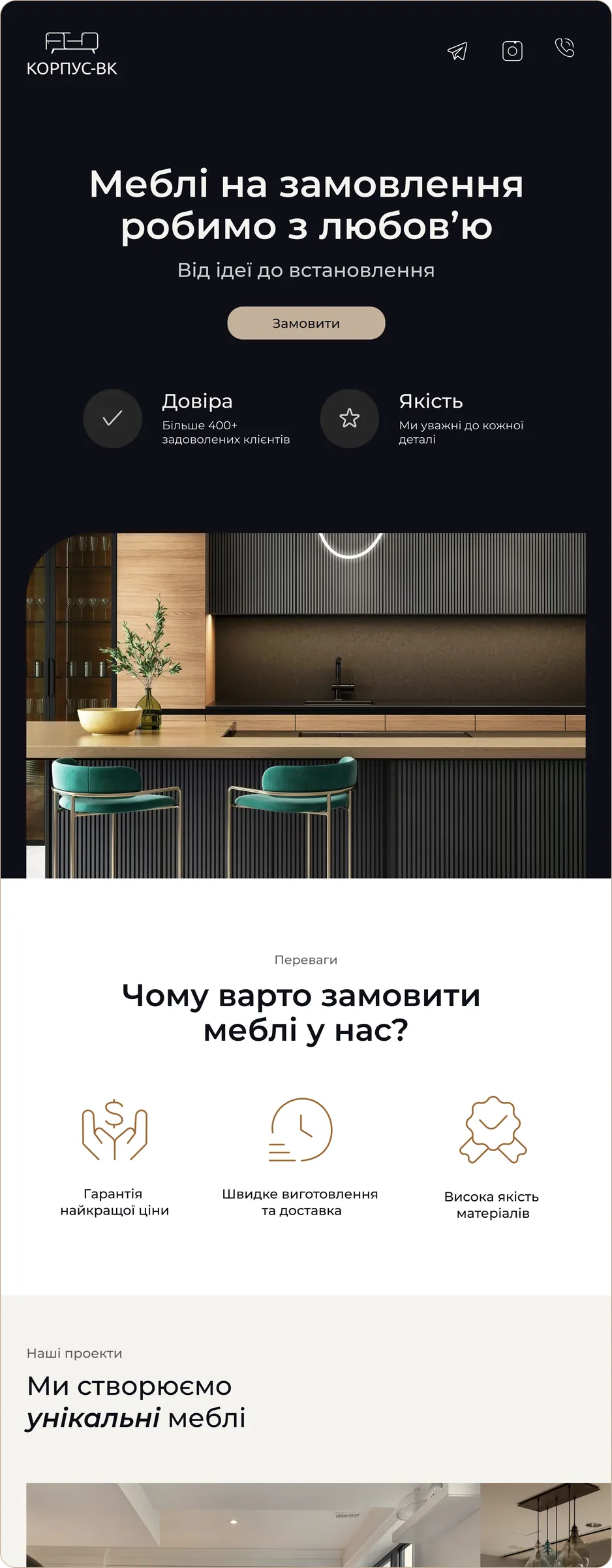
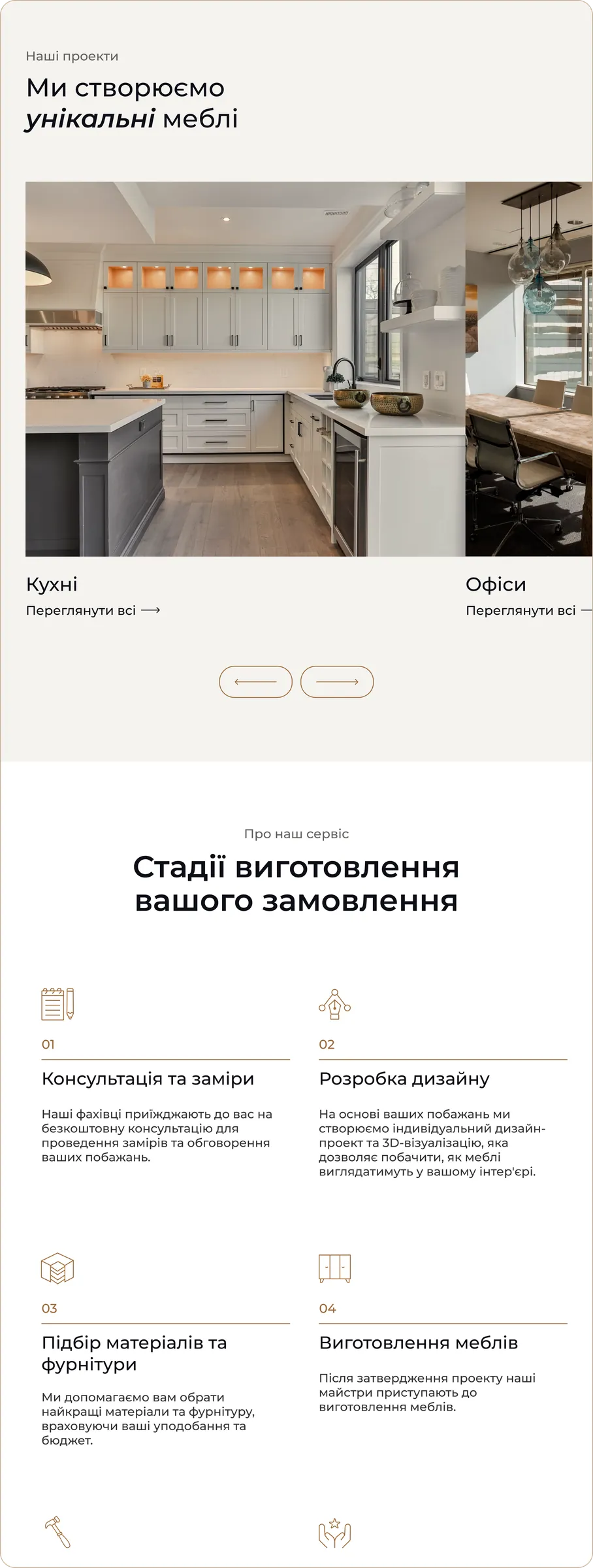
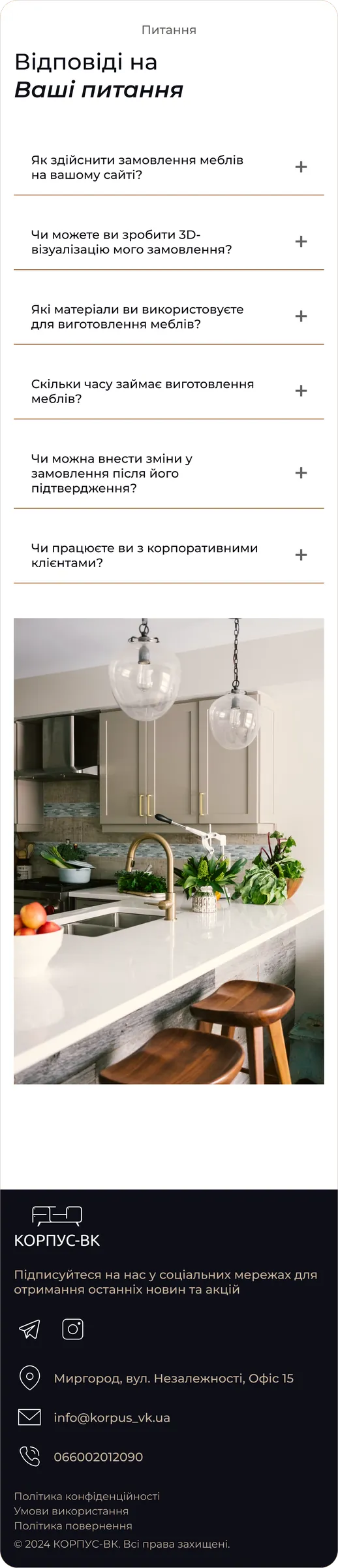
Mobile. First screen, portfolio and stages, client requests, FAQ and footer.

Outcome

Outcome

The site launched in 2023 and became the studio's first online channel, running for about two years. As the war reshaped the regional market, demand dropped and most new orders came through recommendations from existing clients; the studio later closed.

What I learned

  • Design for the person running the business. The owner handled every order himself, so the lead form stayed deliberately short.
  • Know where trust comes from. In a small regional market, people trust recommendations more than ads — a website has to support that trust with real work and clear promises, not replace it.